Beaconhouse National University | Visual Communication Design Thesis 2017
Travel has always been my passion. So, i decided to take my passion towards my final thesis project.

Main category: UI/UX Mobile application
Introducing an application which let everyone plan a trip with few easy clicks.
Process
-
Traveling has been my ultimate passion which later turned into a sustainable* business, as when I started exploring more areas of Pakistan, either on my own or with groups of likeminded expeditors. Lately founded a very enthusiastic startup called “Gol Chakkar Tours” in 2014.
By operating the later mentioned startup, I have been exposed to different languages, people, food, culture, terrains and most importantly overcoming problems related to general tourism, i.e transport links, dealing with locals, time management, health & safety and general safeguarding.
Due to an increasing trend of tourism in Pakistan among the students in Pakistan, I decided to share my travel experience and start exploring with new travelers.
“The growth in tourists visiting these areas increased by 25% in 2016 as compared to last year due to measures taken by the government to improve law and order situation in those areas,” said PTDC Policy and Promotion Manager Mukhtar Ali.
In recent years, tourism in Pakistan have gained a massive boom due to building of Karakoram Highway which has direct access to China Border resulted in over a million domestic tourist traveling to northern region of Pakistan.
So I decided to pursue my interest into my thesis, so why not solve problems and become a source of traveling for every other person.
-
My research started with conducting talks with people who used to travel once in a year or maybe twice. I asked them what problems did they face and how did they solve those problems. Later after identifying problems which included unreliability of vendors for hotel bookings, car booking and other travel agents. Also many reported that there was no good way to contact or book hotels directly in the destination across Pakistan which later I also researched and found only a few hotels being listed on various websites. This showed the untapped potential of making a platform where anyone could plan a trip in a few clicks.
-
I soon started ideating on how we can solve this problem, either by making a mobile application where I would include everything from discovering a place for vacation to booking the hotels. Would someone be able to directly book a hotel from our app? All these questions were answered with support of research into the final product.

After conducting months of research, I started mind mapping different solutions and created a user-flow or app journey to see what can be eliminated and how I can improve the process.
Branding
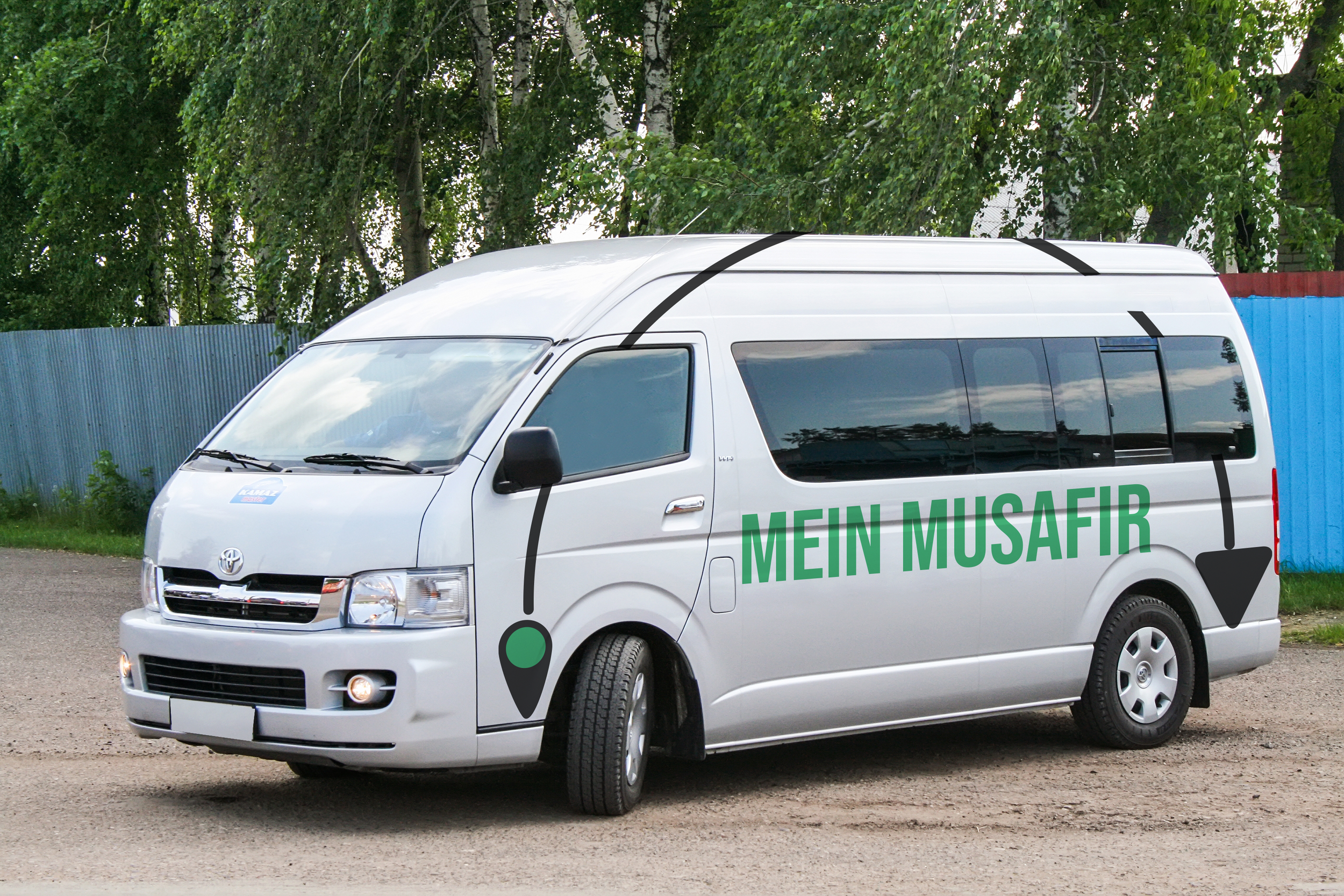
The ideas started coming to life and I started working on the Visual branding of the application. I wanted to name it “Mein Musafir” which means a “I am a traveller” in Urdu. I wanted to keep it local and wanted it to connect with users across the region. My main focus while designing the identity was to keep easily traveling in mind. I wanted to position “Mein Musafir” as a brand for locals so had to keep in mind the colours which would represent travel as fun and easy.

These were the few of the designs that came up while making the logo for Mein Musafir back in 2017.


Designing low-fi and mid-fi mockups and user testing

I started working on the Low-fi on sticky notes and would iterate them as soon as I get it tested by my fellow-students before making it towards the mid-fi. The testers were selected by focusing on the no. of times they travel and are they familiar with traveling or using similar websites/application in this case.

Soon after weeks of user testing on low-fi mockups and consulting my thesis teacher, I started working on the mid-fi mockups and creating informational structure for the application experience.


Final Hi-Fi mockups and testing



Final outcome
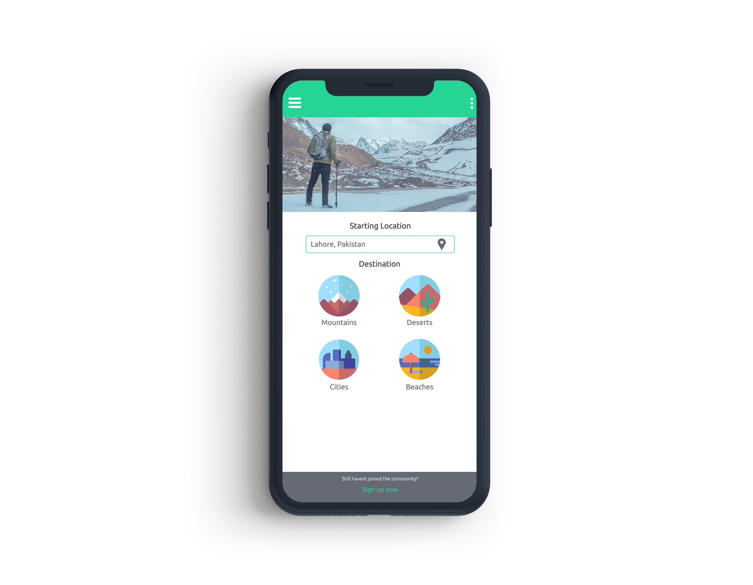
With the research and hi-fi mockups, I was able to bring the solution to the level where people loved it and questioned its existence. Many of the problems were solved while some people came to the display and opened many paths to this application.
Mein Musafir in the end was able to plan journeys for you in while staying in your budget and within a few clicks you had your travel journey ready. It provided screens where people could select the best hotels listed from different providers such as booking.com or jovago.com at that time. It also enabled users to make a check list of bookings they have done and provided routes and recommendation.
The main feature of the application was to enable users to stay in budget so the amount of the whole trip would be displayed on top right where people could instantly see if the budget has been exceeded. We would give recommendation on how to lower your budget or how you choose different locations.

Branding material